The Programmer's UI
I keep finding The Design of Everyday Things more and more useful, both in understanding why things are the way they are and in helping me improve my own designs. If you don’t have a copy of it, go get one. I’ll wait.
Ok, now that you’re back, I’d like to share how it helped me process the reasons for the existence of one of our users’ most dreaded enemies:
The Programmer’s UI
You’ve seen it. The interface only its designer could love.
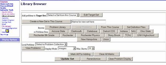
Programmers are notorious for creating UIs like this - busy with buttons, lavished with links, filled with forms. But why is this? Why do we create such god-awful things that make our users curse us (and computers in general) to the deepest level of hell?
I think that it, very simply, has to do with one of the steps we take while using a system - determining which actions are available to us.
There are over 30 choices for a user in that screen above - thirty. Say it takes half a second to determine if an option matches the action you wish to take - you could easily spend 15 seconds just figuring out which button to press. The programmer who designed those buttons, however, already knows all about them, so it only takes him half a second - and then he wonders why anyone has difficulty! After all, every option is right there, at your fingertips!
As the arrogant souls that we are, programmers have a tendency to look down on their users. Why can’t they just do the right thing? Why are they doing that!? Why can’t I only have smart people use my software?
To help combat this, I find it useful to ask a fellow programmer for feedback - someone I trust and respect, but who isn’t familiar with whatever I’m working on. Then, if they tell me the UI sucks, I’m forced to admit it and make it better.
Of course, if you want to continue creating horrific UIs, I won’t stop you. It’s job security for me…
